Negative Space Gives a Picture Room to Breathe
Negative space in art helps you see balance, emphasis and movement. Try a simple looking exercise to decide what an image’s empty areas are doing.
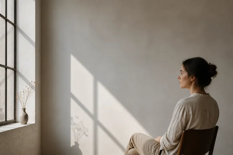
In a portrait, the blank wall beside a face can pull your eye as strongly as the face itself. Negative space in art is the unoccupied area around and between forms; looking at it reveals how a picture balances attention, suggests movement and directs your gaze. Try reading that space in three ways: as a counter-shape, as a route for the eye, or as an active field.
Read the gaps as shapes
Start with the space between objects rather than naming the objects themselves. A gap has a contour, width and direction. It may taper like a wedge, form a narrow channel, or open into a broad patch. Those shapes can make a composition feel compact or expansive before you have worked out what its subject is.
Use this approach when the picture has a clear silhouette: a figure against a wall, a vase on a table, or branches against the sky. Squint slightly or look at the image as a small thumbnail. The details soften, while the larger blocks of occupied and unoccupied area become easier to compare.
Notice whether the gaps feel related. If the spaces between several figures are similar in width, the group may seem orderly. If one gap is much narrower, it can become a point of tension. A small opening between a hand and a face, for instance, may draw attention because it is enclosed by important forms.
This method suits readers who want to understand balance without relying on labels such as “centred” or “off-centre”. A composition can place its subject away from the middle and still feel balanced if a large, quiet area answers a smaller, visually strong form. Compare the shapes on either side, not just the amount of empty area.
Follow the open routes
Negative space can also work like a path. The open area in front of a person looking to one side may give the gaze somewhere to travel. A diagonal gap between forms can lead your eye across the picture, while a tight enclosure may hold attention in one place.
Choose this approach when the image implies a direction: a figure reaching, a bird in flight, or a row of objects receding into the distance. Trace your eye from the most noticeable form. Does the open area carry it onwards, turn it back, or leave it with nowhere obvious to go? None of those effects is automatically better; each changes the pace of looking.
Consider the difference between space that invites continuation and space that feels blocked. A broad area beyond an outstretched arm can make the gesture seem purposeful. If the arm nearly touches the edge, the reduced space can make the action feel compressed. The picture’s boundary is part of the composition, so check what happens where forms approach it.
This reading is useful for images with implied movement or a strong directional gaze. It can be less helpful if you treat every gap as an arrow. Some open areas simply let the eye rest, and a still image need not send you around the frame in a fixed sequence.
Let the empty area become an active field
In some pictures, the open area is not merely a backdrop or a route. Its colour, texture, light or repeated marks give it presence of its own. A pale ground can make a dark form feel sharp; a restless pattern behind a subject can make the surrounding space feel busy rather than calm.
Use this approach when the background has visible treatment or when the subject is sparse. Look at the area’s edges and surface. Does it seem flat, deep, soft, rough or patterned? Then ask how that quality changes your sense of the nearby forms. A blank-looking patch may feel expansive, while a similarly sized patch crowded with marks may feel dense.
Imagine a small red bowl placed on a plain, cream-coloured tabletop. If the surrounding field remains quiet, the bowl may become the first point of attention and seem isolated. Add a dark cloth that presses close to one side, and the reduced open area may make the bowl feel more anchored or constrained. The change comes not only from the new object but from how it reshapes the space around the bowl.
This approach suits paintings and photographs where background treatment matters as much as the main subject. It also helps you avoid calling an area “empty” simply because it contains no recognisable object. Surface and colour can make open space visually active.
Choose the reading that fits the image
These approaches can overlap, but one will often give you the clearest starting point. Ask what the picture seems to emphasise. If its forms have striking outlines, compare the gaps as shapes. If a gesture or gaze points somewhere, follow the open routes. If the background has a noticeable surface or colour, read the space as an active field.
- Choose counter-shapes when you want to judge how forms fit together and whether the composition feels balanced.
- Choose open routes when you want to understand direction, pace or the pressure created near an edge.
- Choose an active field when colour, texture or pattern in the surrounding area changes the mood of the subject.
Then check your first reading against another. A gap may be both a wedge-shaped counter-form and a route that carries your gaze. The second reading is useful if it changes what you notice; if it only repeats your first impression, move on to a different part of the image.
How can you look at negative space?
What is the simplest looking exercise?
Pick any image and choose one noticeable form. Look at the surrounding area instead, tracing its boundary with your eyes and noting whether it is broad, narrow, enclosed or open. Then look back at the form and ask how that space affects its prominence.
Should I ignore the subject while I look?
No. Use the subject to locate the surrounding space, then shift your attention between them. The point is to notice their relationship, not to pretend the subject is absent.
Does more negative space always make a picture calmer?
No. A large area can feel tense if it is sharply coloured, patterned or crowded against a form. The character of the space depends on its shape, treatment and relation to the picture’s edges.
How do I tell whether an empty area matters?
Ask whether changing its apparent shape or position would alter the balance, direction or mood you perceive. If it would, the space is doing visible compositional work; if not, it may be less important to your reading.
Try the exercise on an image you already know
Choose a photograph on your phone, a page in a book or a picture on a gallery wall. First, name the largest open area without describing the objects inside the image. Is it a broad field, a channel between forms, or a small enclosed gap? Next, follow the edge of that area and notice where your eye slows or changes direction.
Now make one simple comparison: cover part of the image with your hand, or view it through a paper frame, so that one section of open space disappears. Notice what shifts. The main form may seem more prominent, less balanced or more tightly confined. Move the frame and compare again; the point is to observe how the composition changes, not to declare one version correct.
Negative space in art is easiest to recognise when you give it a specific job: shaping a gap, carrying the gaze or setting an active field around a form. Use whichever reading fits the image, then test it by shifting your attention or changing your view. That habit makes a picture’s quiet areas easier to see—and its visible subjects easier to understand.